Quiet Loud Event Website
Project Details
User research and concept design exploration for an updated homepage targeting Gen Z users.
Project Contribution
Project Tools
A project for Quiet Loud, an events booking platform looking to provide a seamless user booking experience for custom events.
My task was to research Quiet Loud’s target market of Gen Z users. Using this research I was asked to suggest a design route for the homepage that would appeal to this target market.
Target Market Research
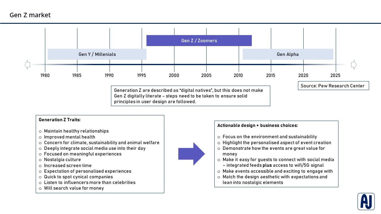
Using secondary source research methods, I started to research the trends and choices taken by the target demographic – Gen Z. Rooting the research on academic studies and building on other usability testing, I was able to form a solid definition and foundation for the user group.
By electing to use data graphs and short quotes whilst presenting the research to the project stakeholders I maintained their interest and quickly communicated a top-level synopsis of the target users.
Building on this foundation, I moved into researching the user group more thoroughly, by inferring data from multiple sources and looking at key trends that resonate with the target users, I was able to distil a core set of traits that are shared with Gen Z users.
To provide value for the client I further refined these traits into actionable design choices that lead to business outcomes at match the client goal of increasing revenue in the Gen Z market.
Persona building + wireframe journey
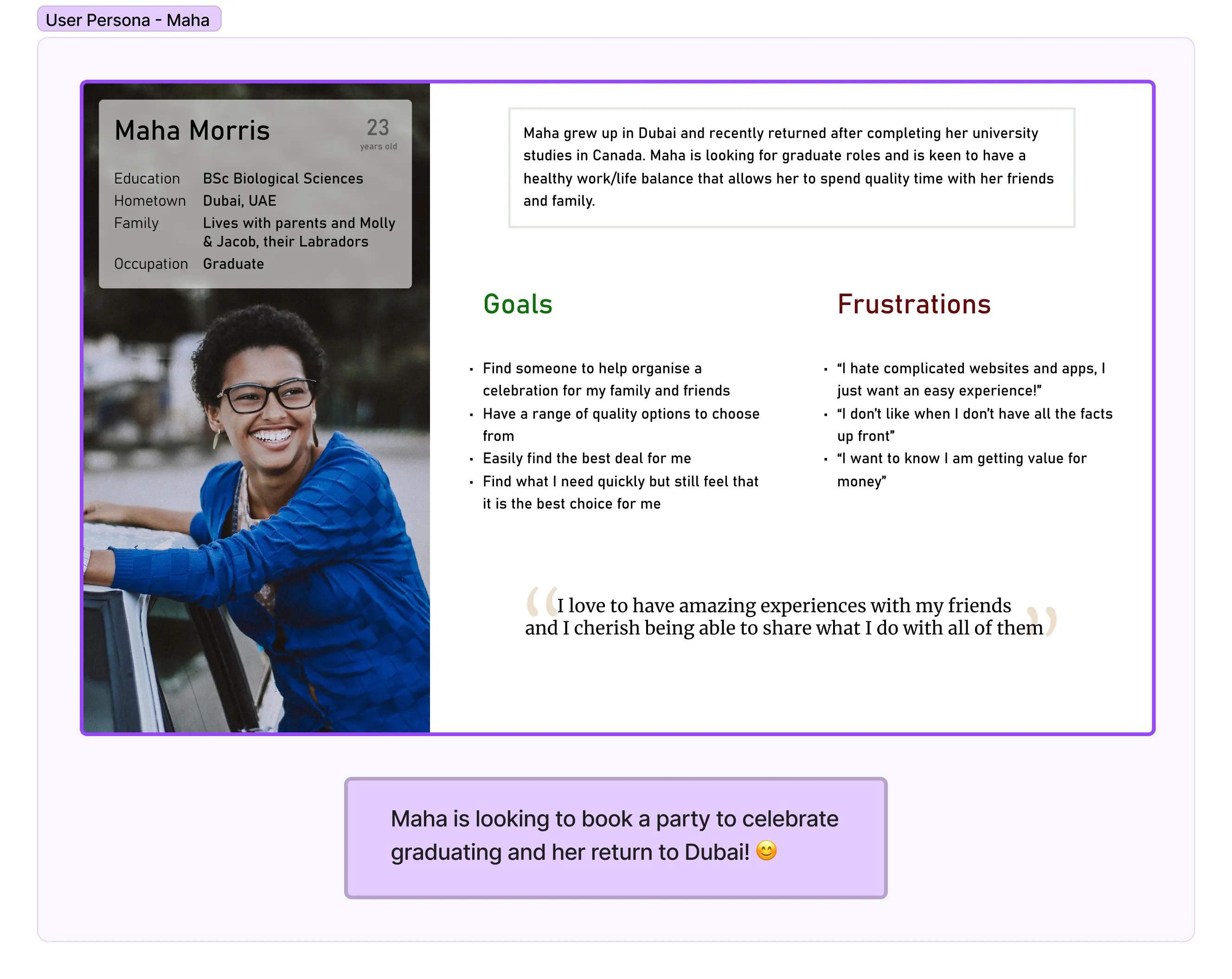
To help frame the future design work with the target user in mind, I opted to create a user persona based on the research conducted so far. The persona is framed as a typical user of the product.
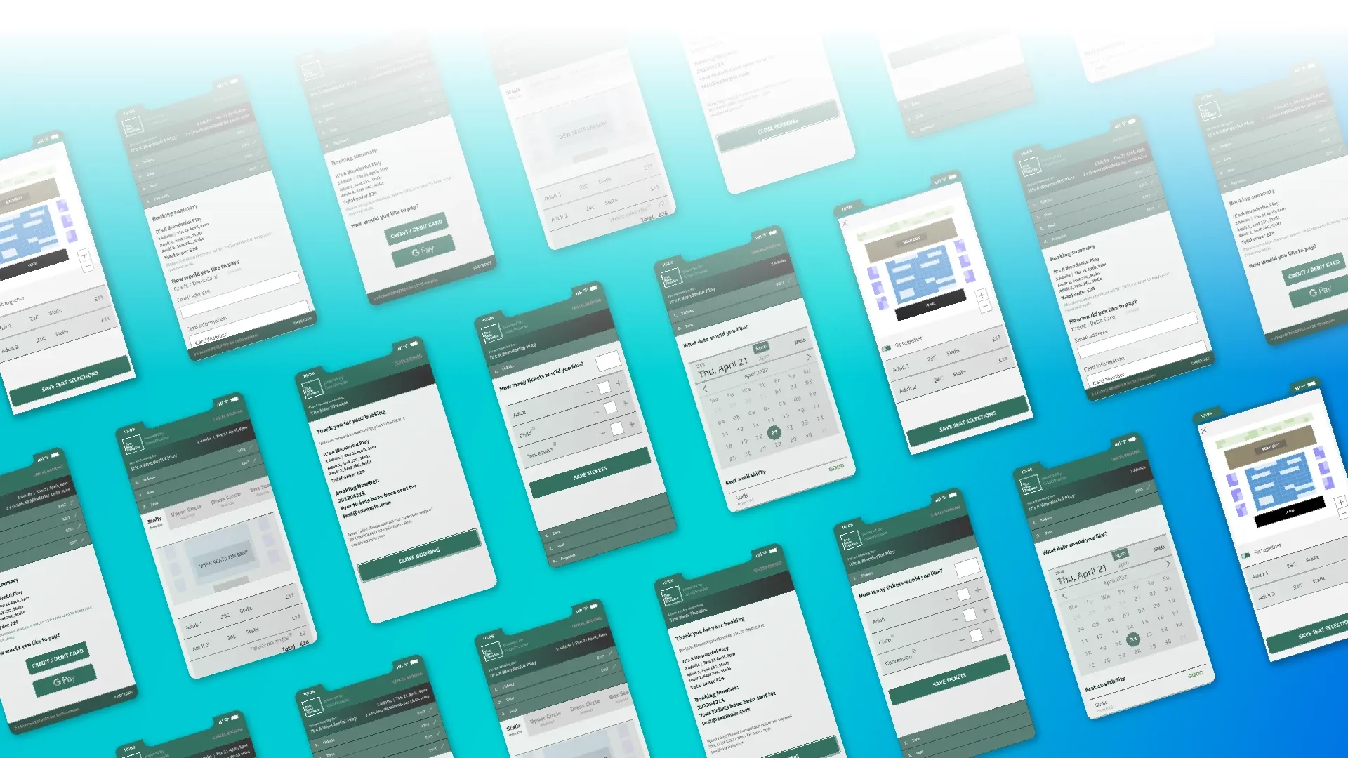
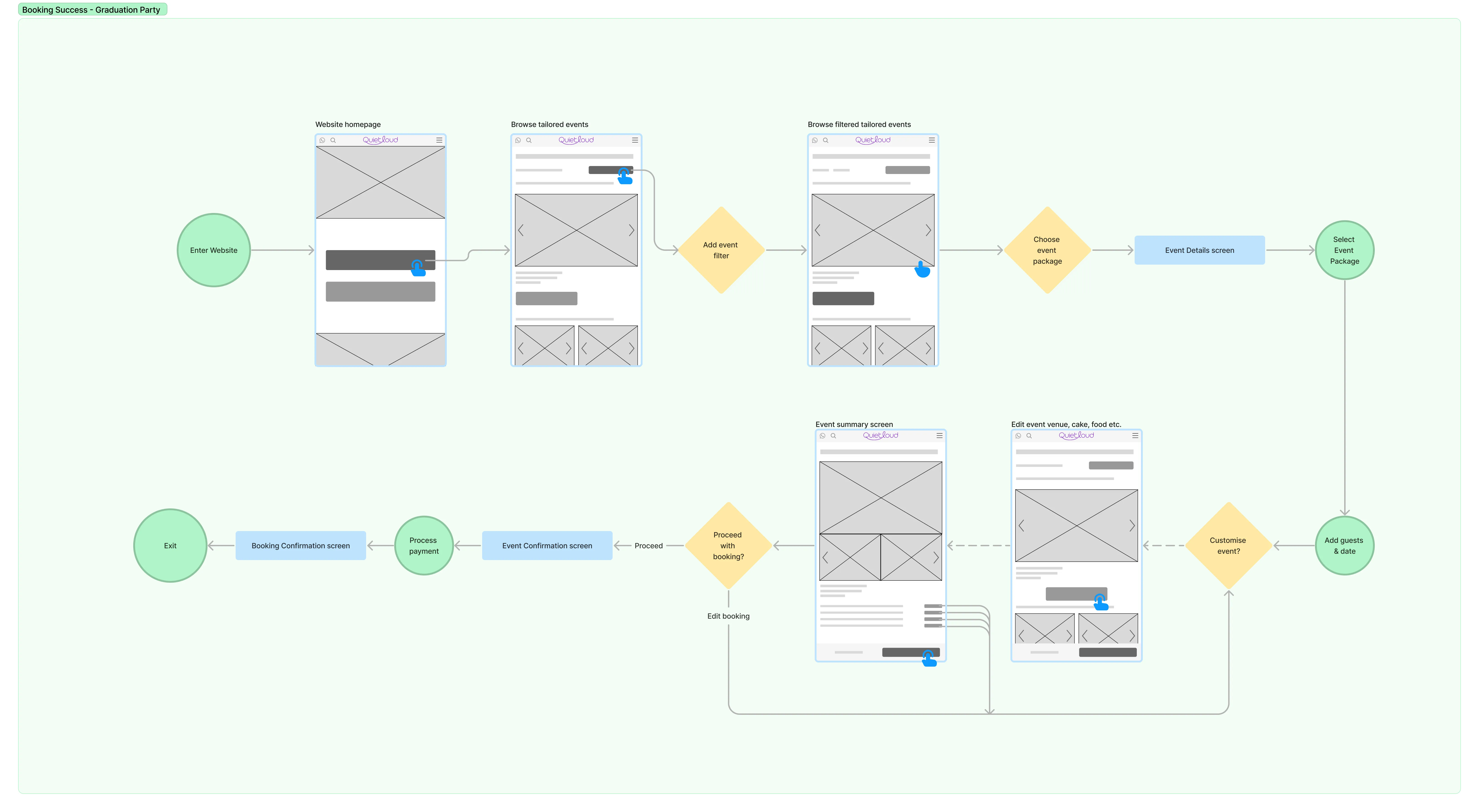
The client was looking to build the technology platform that would run the business they were also interested in the creation of wireframe models that would showcase a typical booking scenario. I created a low-fidelity user flow that showed the customer journey through event selection and booking.
Website Design
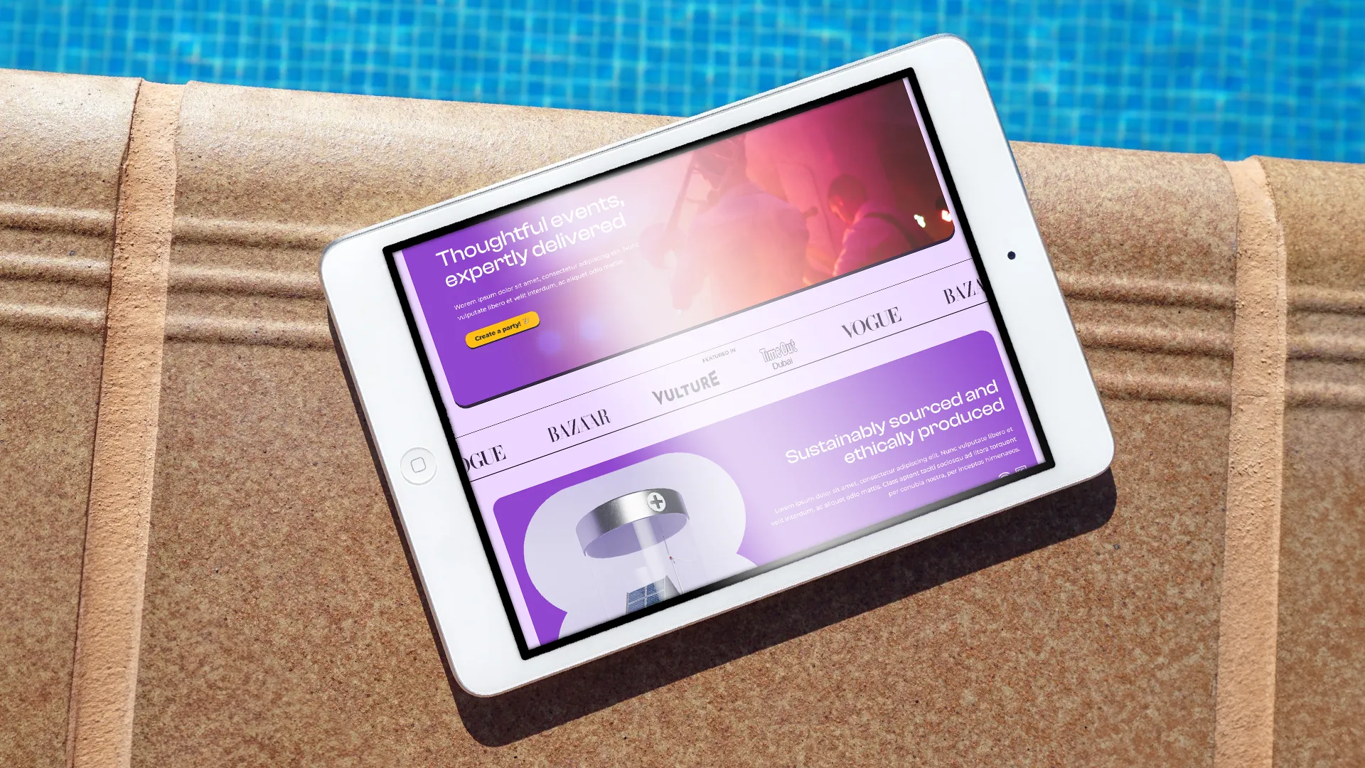
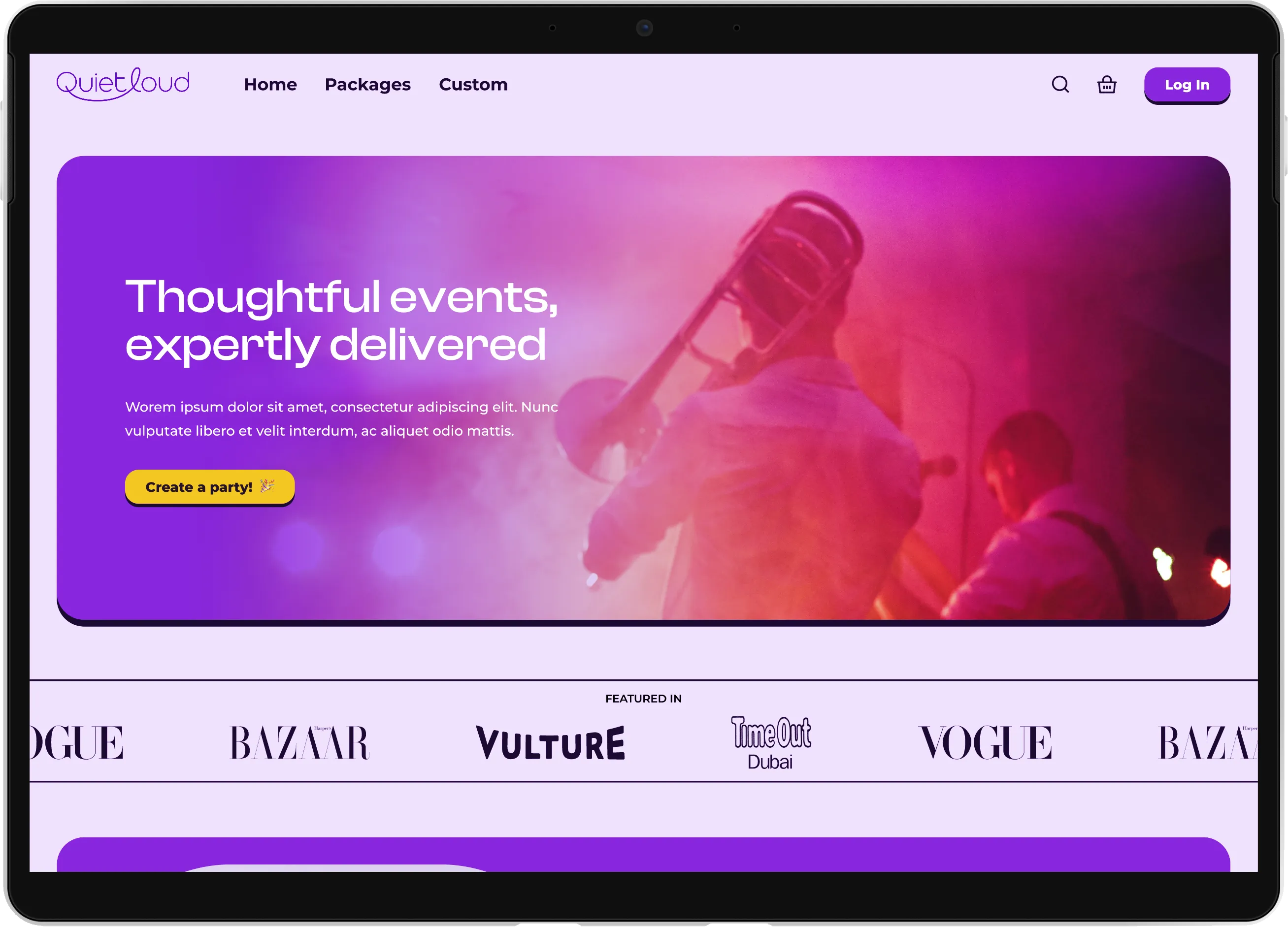
The hero section focuses on the company and sets the stage for the user. For the Gen Z users, their call to action is to start planning an event.
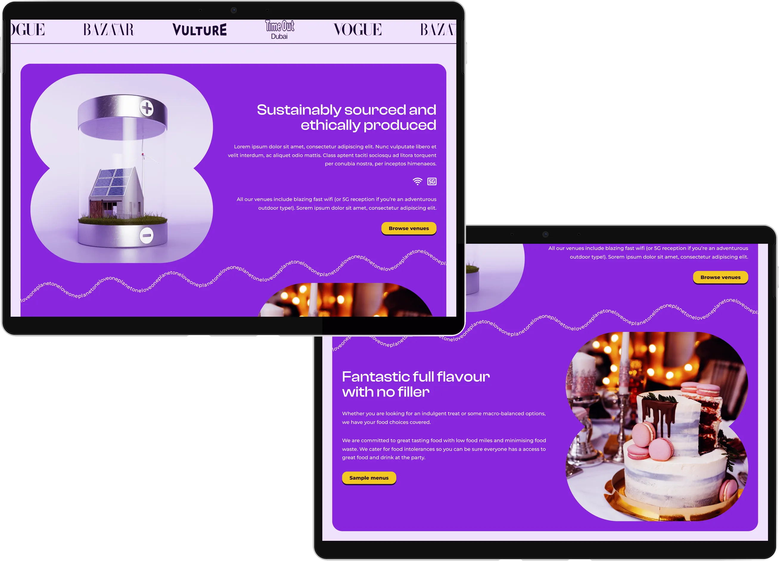
The scrolling media list provides reassurance from media outlets users are familiar with and helps to avoid user cynicism.
The top two sections call out the client’s ethos on environmental and sustainability issues. The pledge is to provide venues and food that align with the Gen Z users’ ideals on these issues and to assure them that the client shares the same goals.
The wavy text is used to create a fun, nostalgic type element.
Target market design
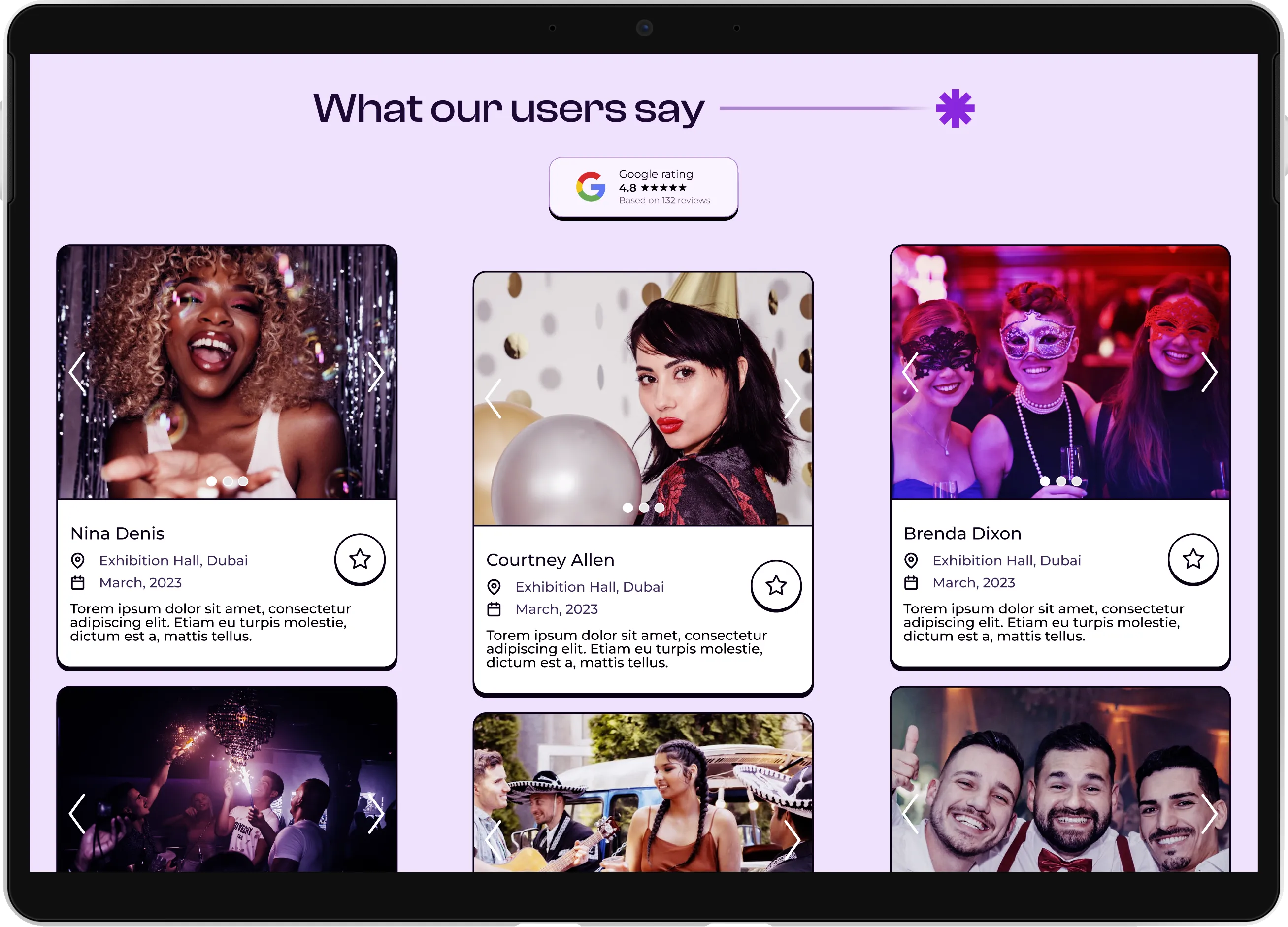
Gen Z members respond when they can see others who look like them using and interacting with products. The testimonial section works to showcase the diverse nature of events available but also reveals them as accessible.
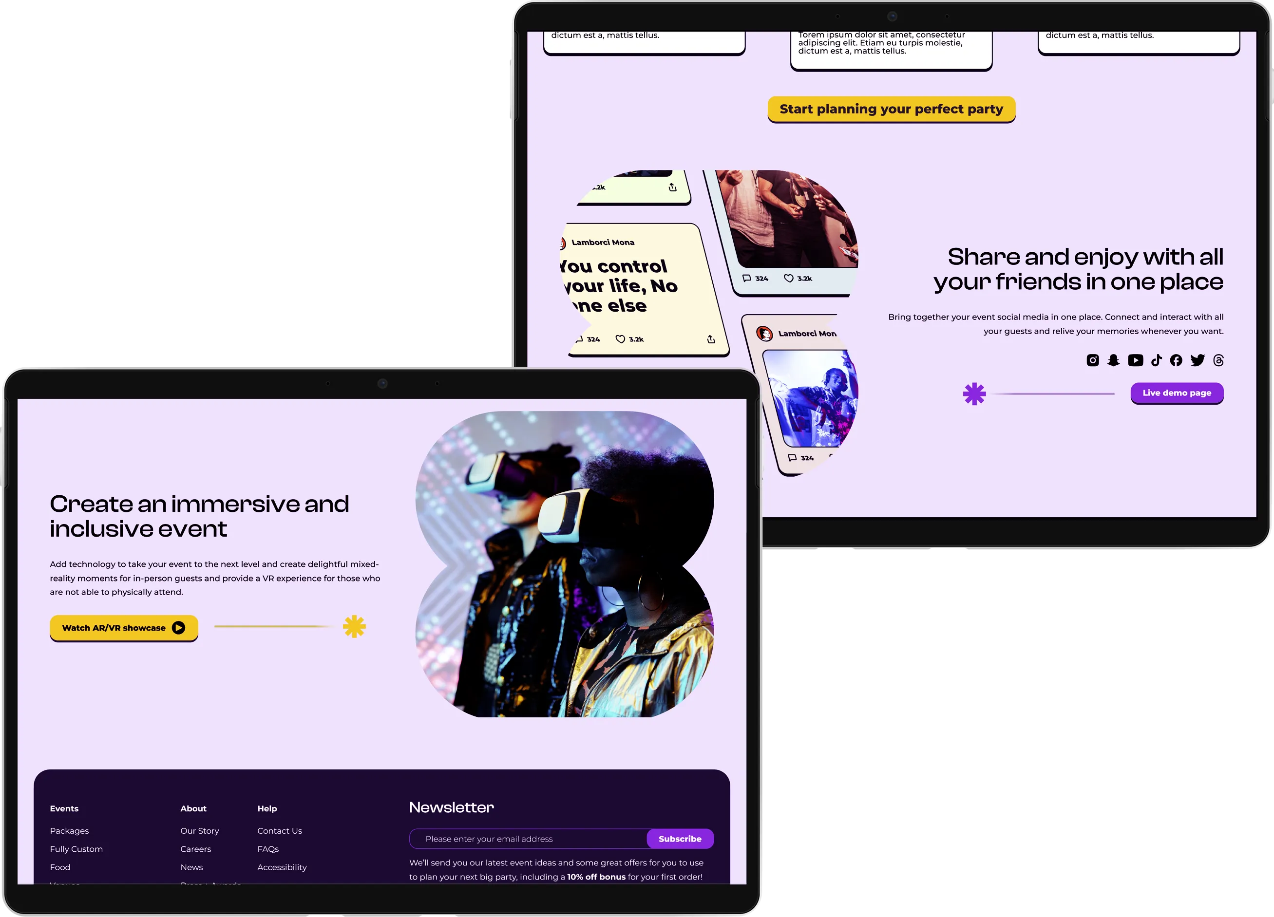
Referring to the traits of Gen Z users, and their associated design insights, by highlighting a social media technology platform, the user immediately understands that the company takes social media sharing as seriously as they do.
To demonstrate that the company is on the cutting edge of technology, Gen Z users can envisage how augmented and virtual reality can play a part in their event – either to make it inclusive and accessible, or just as the added cool factor that will enhance the experience.


Seen Something You Like?
I hope you enjoyed this ui design project. If you feel I could be a good fit for something you are building, I'd love to chat!
I thrive as part of multi-disciplinary teams but I am equally happy to fly solo when needed and I am always happy to offer advice and guidance.
get in touch